“Accessibility removes barriers and unlocks the possible.”
If you’re familiar with Huxley, you’ll know that we’re passionate about accessibility – we want the internet to be fully inclusive to all people, including those living with physical impairments, cognitive disabilities, and environmental or technological barriers. Over the past few months, we’ve been sharing accessibility tips on our social media accounts. To mark Global Accessibility Awareness Day on 20th May 2021, we decided to consolidate all the tips we’ve posted so far into a blog post to make it easier to refer back to.

1. Use high-contrast colour combinations.
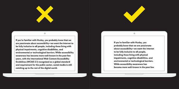
This is mostly talking about value rather than hue, though we’ll get into hue in a later tip.
Let’s try a quick exercise. Check out the image to the right and squint your eyes. Which word pops out at you more? The white one, which has higher contrast, is much easier to read.
The W3C requires a contrast ratio between text and its background of at least 4.5 to 1, which can be checked with WebAIM’s contrast checker.
According to the World Health Organisation, blindness and vision impairment affect at least 2.2 billion people around the world.
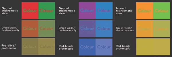
2. Avoid clashing colour combinations.
Maintaining a high hue contrast can be just as important as value contrast. Combinations like red + green, purple + blue, or orange + green can be difficult to differentiate between for people with colour blindness, or those with uncalibrated computer or mobile screens.
According to Colour Blind Awareness, approximately 1 in every 12 men (and 1 in every 200 women) are colour blind, making up 4.5% of the British population. Though people with colour blindness can see clearly, certain colours, like red, green, or blue, can be problematic.
Check out the Colour Blindness Simulator here
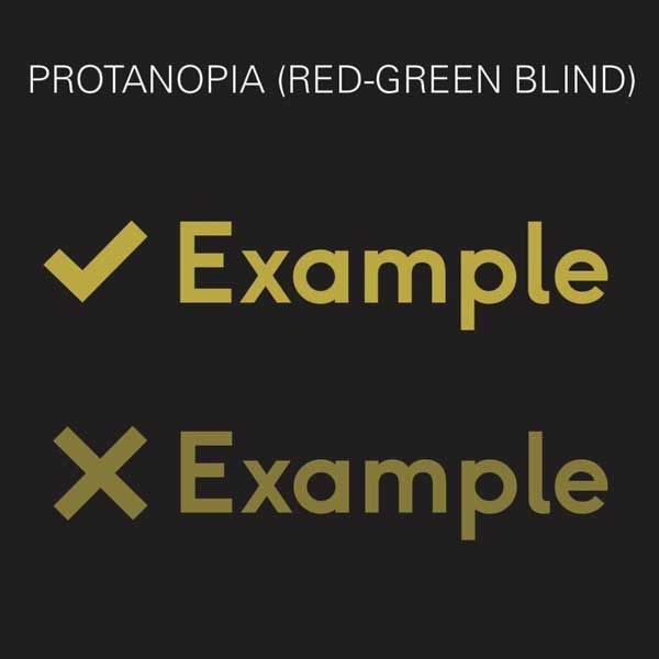
3. Use more than just colour to indicate important information.
Try using different patterns, icons, or text labels to coincide with colour changes.
For example, say your website instructed someone to click on the green link. A user with normal vision might be able to differentiate between a red and green option, but someone with colour blindness might have trouble. By adding icons alongside the colour changes, more users will be able to choose the correct option.

4. Simplify your text.
In this digital world of fast scrolling thumbs, 5 second videos, and 280-character memos, it’s easy to see why simplifying your text is important for inclusivity.
You’re (presumably) not writing a novel or college paper with a word count, so avoid the gobbledygook and get to-the-point.
Simplified text looks more personable, more professional, and more readable for those with dyslexia, vision impairments, attention disorders, ESL speakers, and everyone everywhere. Trust us, your audience will thank you.
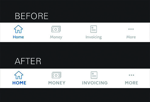
5. Accentuate small text with uppercase, weight, and letter spacing.
If you HAVE to use small text, like in navigation, then at least make it easier for your audience to read it.
In this example, we show how the Paypal app navigation currently looks, and then recreate it according to these tips. Which one is easier to read?
6. Use a line height of at least 1.5 (150%).
W3C recommends using a line height of at least 1.5 (150%), and it’s easy to see why.
The space between the lines makes it easier to guide the viewer’s eye to the next line, plus it looks cleaner and more professional.
A small adjustment like this can mean a world of difference to your audience, so always make sure you’re designing with accessibility in mind.
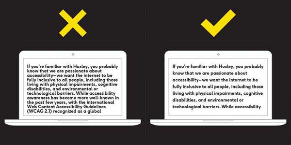
7. Shorten your text line lengths.
Specifically, between 50-60 characters on desktop and 30-40 characters on mobile.
We’ve talked about font size and line height, so now it’s time to talk about line length. The last thing you want to do is make your audience have to move their head side to side. The truth is, no one is going to read your copy if it’s going from screen edge to screen edge with no margin. It’s overwhelming and looks bad.
By keeping it between 50-60 characters (or 10-15 words), you’re making it easier for your viewer to skim or scan your information. Of course, this all depends on the font size you use, but as a general rule, it’s better to keep large blocks of text at a short length.
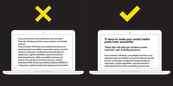
8. Use clear visual hierarchy.
By using separate styles for headings, subheadings, and body text, you are making it easier for your audience to find and comprehend text content.
It’s also important to ensure you’re using the correct HTML tag for each section, as screen readers use these to read linearly.
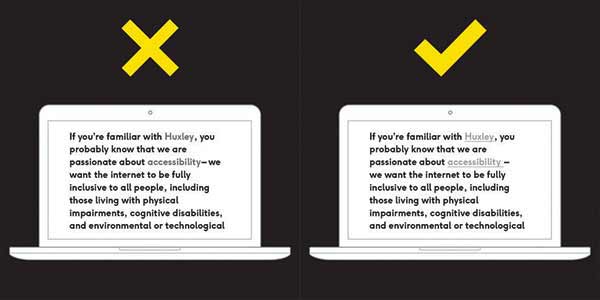
9. Make links look like links.
Ensure your link style looks different from the surrounding text. This will make it easier for users with visual impairments, as well as users that are scanning or skimming. If it’s too similar, it likely won’t be clicked on.
You can increase the colour contrast, change the type weight, add an underline, or combine these elements to make the link stand out.

10. Keep button text short.
By maintaining clear call-to-actions, you can ensure your website is readable and clutter-free. This is important for those who use screen readers, as well as those who are trying to scan for important information.
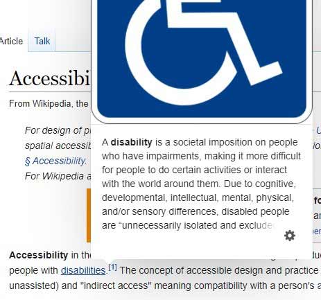
11. Don’t make people hover for content.
When content is hidden until pointer hover, it can be problematic for those who use screen readers, zoom magnification, or smaller screens – in fact, it’s not at all possible on touch-screen devices. In this example, we look at links on a Wikipedia page.
On hover, the links show the first paragraph of the link’s own page, and sometimes an image, which can extend past the scroll window. When you move your cursor away from the link, the information disappears.
Instead, content should be static and obvious with appropriate hierarchy. In this case, Wikipedia could find a better way to display extra information or do away with the feature altogether in order to be inclusive across all audiences.

12. Optimise keyboard navigation.
WebAIM says it best:
“Keyboard accessibility is one of the most important aspects of web accessibility. Many users with motor disabilities rely on a keyboard. Some people have tremors which don’t allow for fine muscle control. Others have little or no use of their hands, or no hands at all. Users without disabilities may use a keyboard for navigation because of preference or efficiency.”
Ensure focus states are clear and obvious, your interactive elements follow a logical order, and your navigation isn’t too lengthy.
It’s easy to test it yourself – try to navigate your website without a mouse and note any problem areas you find.
Info from:
Inclusive And Accessible User Interface Design Tips – Try Design Lab
Designing for Accessibility is not that hard – UX Design
7 Things Every Designer Needs to Know about Accessibility